Its been a bit of a weird shady grey blue (purple?) sort of week but all I could think of for this topic was that awful song from the 80s by Corey someone(?) "I wear my Sunglasses at Night"- ahhhhh... frightful really. So I let it be and waited for a better idea to pop into my head... and waited... and waited. Then as I was staring at the wall thinking maybe I'd give this week's topic the big flick, I realised I was staring at a pencil drawing of a very shady weirdly distorted man's face wearing glasses that i had drawn in college ages ago. Hmmm... a bit of photoshop magic and here is my shady overly-distorted weirdo wearing shades, in shades of purple (of course). See below for how it was created. I think the song that comes to mind is now "I'm a Creep"...
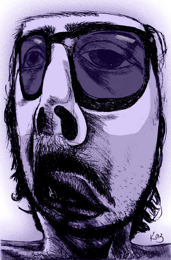 |
| Shades - the original drawing was drawn in lead pencil using a grid to create the exaggerated distorted view (see below for process). I then scanned it onto the Mac and played around with photoshop effects and colourisation to give it an edgier darker shadier(?) feel. OK creepy... |
How did I get it so distorted without using a computer? By hand drawing an exactly proportioned grid over the reference pic and then drawing another randomly spaced grid on a large piece of paper (some lines closer and some lines far apart making some squares very small and others very large). I then drew the face square by square, resulting in a very distorted view of the original face. This was done in a drawing class at college and is such an interesting idea... must do more with this!
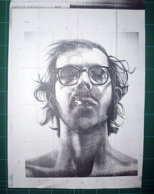 |
| Original ref with exactly proportioned grid drawn over it. |
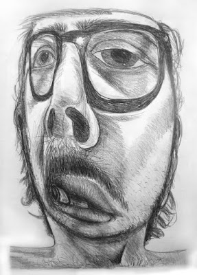 |
| Original pencil drawing - I love this sketch! People always look at me strangely when I say that?! |


Oh Karen, this is AWESOME!
ReplyDeleteRadiohead Creep is thumbs-up too.
I can't stop staring at this, really great!
Thanks Angel - I was trying to think who sung that song - Radiohead, of course! Great song. :)
DeleteGreat work! I like that grid technique. Must try it one day.
ReplyDeleteThink I'm going to do some more too! Thanks for your comment :)
DeleteThis is nice! Thanks for visiting my blog!
ReplyDeleteWhat a great exercise in controlled exaggeration! Might have to try this myself. Nicely done!
ReplyDeleteThe purple version has made the graphite drawing a much more powerful and graphic statement. It's really professional looking. I like it! I also recognize your original source image. He was a photorealist from the 70s? who did those big portraits of people he knew, warts and all.
ReplyDeleteThanks Ted! Always wondered who the face was - it has such interesting character! Also interesting to know he was a photorealist who created big portraits... I have become obsesses with doing big faces - spooky!
DeleteWhoaaa... This is super cool... I like the distortion. The purple coloring really makes the whole thing.
ReplyDeleteThanks Sarah! Purple seems to have taken over my brain at the moment...
DeleteKaren, the artist's name is Chuck Close. Do a Google image search and you'll see your source image which was a large self portrait. Had to do a little sleuthing myself to remember the guy.
ReplyDeleteThanks so much for that Ted! Very interested in seeing his work... :)
DeleteI did all kinds of different things in college but I've never come across this method before, what an amazing idea! He certainly does look creepy! :)
ReplyDeleteJess xx
Now there's something you don't see every day. I think I like the purple one, too, and not just because purple is awesome! The way you added big blocks of lighter color to highlight his face is really great. It really is a cool technique.
ReplyDeleteVery cool!
ReplyDeleteOK, that is very fun! What a great idea - and result! Lots of fun art on all your pages!
ReplyDelete